A presentation works well when a speaker leads it: slide by slide, at their own pace. But when people open the link on their own — usually on a phone — slides struggle. A website made from the same presentation, a long page with a header, a menu and a button, is easier to read. Here's when you need one, how it differs from slides and how to restructure your material without rewriting it from scratch.
When a presentation works better as a website
- People read the link without you. A client proposal, a product overview or a course outline gets opened whenever it suits the reader, often on the go. On a phone held upright, a 16:9 slide turns into a narrow strip with tiny text, while a web page reflows to the width of the screen.
- The page should live for a while. An event, a course, a portfolio, a product — people come back to such pages, forward them and link to them.
- You want requests. A website keeps its call-to-action button in the header and at the end of the page, and the form sits where that button leads.
- You want to be found. A page has headings, a title and a description, so a search engine can find it — if you allow it.
Slides are still the better choice for a talk, a defense or a meeting where you share your screen, and for when someone asks for a file.
How a website differs from slides
| Slides | Website | |
|---|---|---|
| Format | A 16:9 frame, the same on every screen | A page that fits the screen width |
| How people view it | One slide at a time | Scrolling and jumping through the menu |
| Text | A minimum; the speaker says the rest | A bit more, but easy to skim |
| Call to action | On the last slide | In the header and at the end of the page |
| Search | Hard to find | Headings, page title and description |
The key difference is that a website has no speaker. Every section has to explain itself: the heading states the takeaway, not just the topic.
How to turn slides into a page
- Title slide becomes the hero. A headline that makes a promise, one line of explanation and a button. Within a couple of seconds a visitor should know where they are and what they can do here.
- Agenda becomes the menu. Menu items are the sections of your presentation. Three or four short ones keep the header on a single line.
- Slides on one topic become one section. Three slides about benefits turn into a section of cards; several numbers in a row become one strip of figures.
- Drop what only matters during a talk. Slide numbers, footers, “Thank you for your attention”, “Questions?” — a page doesn't need them.
- Add what slides never have. Answers to common questions, client logos, pricing, contacts in the footer.
- Keep one main button. “Sign up”, “Request a quote”, “Discuss a project” — one action, in the header and at the end of the page. Five different buttons scatter attention.
- Check it on a phone. Long headings, wide tables and small chart labels break first.
- Label the page. The title for the browser tab and search, the description and the link preview image are what people see in search results and messengers before they see the page itself.
Common mistakes
- Slides as images on a page. A presentation embedded on a site as images doesn't reflow for phones, and a search engine can't read the text in those images as text.
- A ten-item menu. The header wraps onto two lines, and on a phone the menu turns into a long list.
- Text inside images. Words on a photo don't adapt to the screen width and don't get translated along with the page.
- Two separate copies. A website built apart from the presentation drifts away from it after the first edit: the price changed in the slides, but the old one is still on the site.
How to do it in JamPres
In JamPres, the website is the same presentation in another view. In the editor, click “Website” in the “Slides / Website” switch: sections are built from slides by their role. The title slide becomes the hero, the agenda becomes the header menu, consecutive slides of the same kind become one section, and a slide that continues onto the next one becomes a single section.
Edit right on the website: what you change there stays on the website, and everything else follows the slide. “Match the slide” removes your website edits, and “Hide on the website” hides a section while the slide stays in the presentation. “Add section” opens the section library, which has a “Website only” group: “FAQ”, “Logos” and “Pricing”.
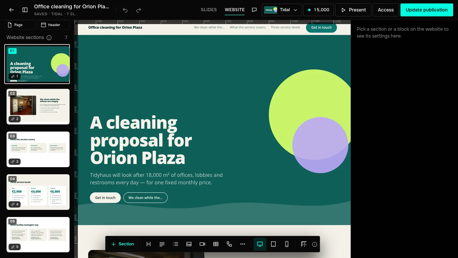
The “Website header” holds a menu of up to four items and a button: your own label, where it links to, or “No button”. The “Website footer” takes a line of text, email, phone, address, links and social profiles. “Page” has “Title in the tab and in search”, “Description for search and links” and “Link preview image”. To see how the page looks on different screens, use the “Desktop”, “Tablet” and “Phone” switch.
To publish it as a website, go to the presentation page and choose “Website” under “How to show it” — the link stays the same. Want to offer both views? Turn on “Button to the slides” in “Page”: the website gets “View as slides”, and the slides get “View as website”.
Forms and polls work on the website just as on slides, and from the Base plan analytics shows “How far they scroll the website”, section by section. The website view is on every plan: on Free there's a JamPres badge at the bottom of the page, from the Base plan there isn't. A custom domain for the site is coming soon on the Pro plan. PDF and PowerPoint files are downloaded from the presentation; the website isn't part of them.
Build a presentation from your text and open the website view — the header, menu and footer are put together for you.
Presentation as a website